Rebekah Adams
Geospatial data scientist
Masters of Urban Spatial Analytics '23
University of Pennsylvania
Say hello
LinkedIn
Github
Portfolio
Where Should Philly Build New bike Share Stations?: Predicting and Evaluating for Philadelphia’s Bike Share Expansion
Indego, Philadelphia’s bike share system, wants to expand their network to increase ridership (revenue), accessibility, and equity. To help Indegeo evaluate different expansion plans, we created Station Planner. As our team’s machine learning lead, I built a model that predicts areas of high and low ridership across Philadelphia. Powered by these predictions, our interactive tool lets planners place new bike stations on the map to see what expected future ridership, accessibility, and equity looks like for the system.
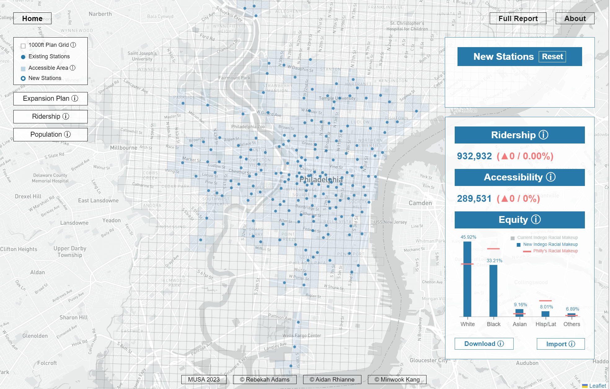
Check out our interactive app, our summary presentation, or follow along with our R code and report.
This project was produced as part of the University of Pennsylvania’s Master of Urban Spatial Analytics (MUSA) Spring 2023 Practicum course with my colleagues Minwook Kang and Aidan Rhianne.
Where is the city growing?: Identifying Urban Land in Indonesia Using Convolutional Neural Networks
Cities across the Global South are expanding rapidly. Yet few datasets include up-to-date information on land cover in many of these countries, making it difficult to track this urban growth. To address this dearth of information, I worked with Tiffany Tran to pilot three deep learning algorithms to identify urban land in the city of Cirebon, Indonesia.
For this project, I created a novel dataset of satellite images of Cirebon and its surrounding area, based on the city’s most recently mapped area (2014). I then used these images to train and test three different types of convolutional neural networks using Tensorflow in Python. Our best model accurately identified urban vs. non-urban images 82% of the time.
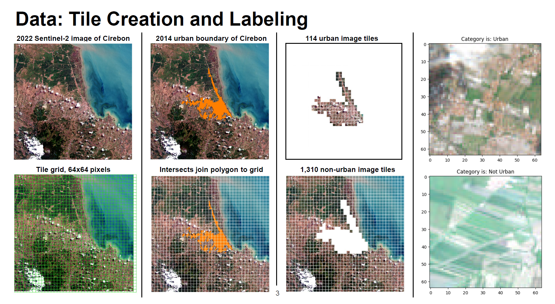
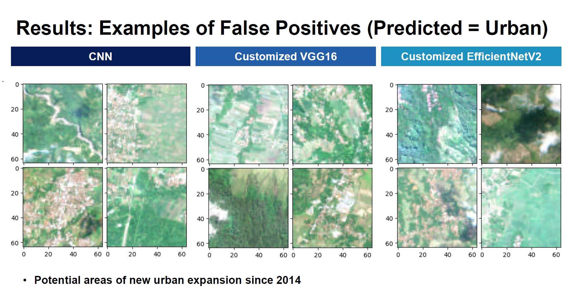
But what we were really intersted in were the images that our models thought were urban areas, but according to the most recent (2014) mapped boundary were not urban. These “false positives” give us a feasible way to identify potential areas of new urban expansion since 2014.
Check out our summary presentation, follow along with our Python code, or read our report.
Estimating Causality: Estimating the Impact of NC-540 on Home Values
Wake County, North Carolina is in the process of building NC-540, a tolled beltway through Raleigh’s outer suburbs. I wanted to know: what impact has the highway had on nearby home values?
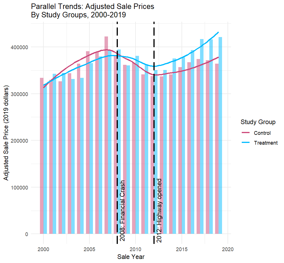
Using a Differences-in-Differences approach, I estimate that single-family homes within two miles of NC-540 have seen their values increase by more than $36,000 thanks to the new highway. When home features are taken into account, the effect is even larger: homes near the highway have seen an average $49,000 boost in value.
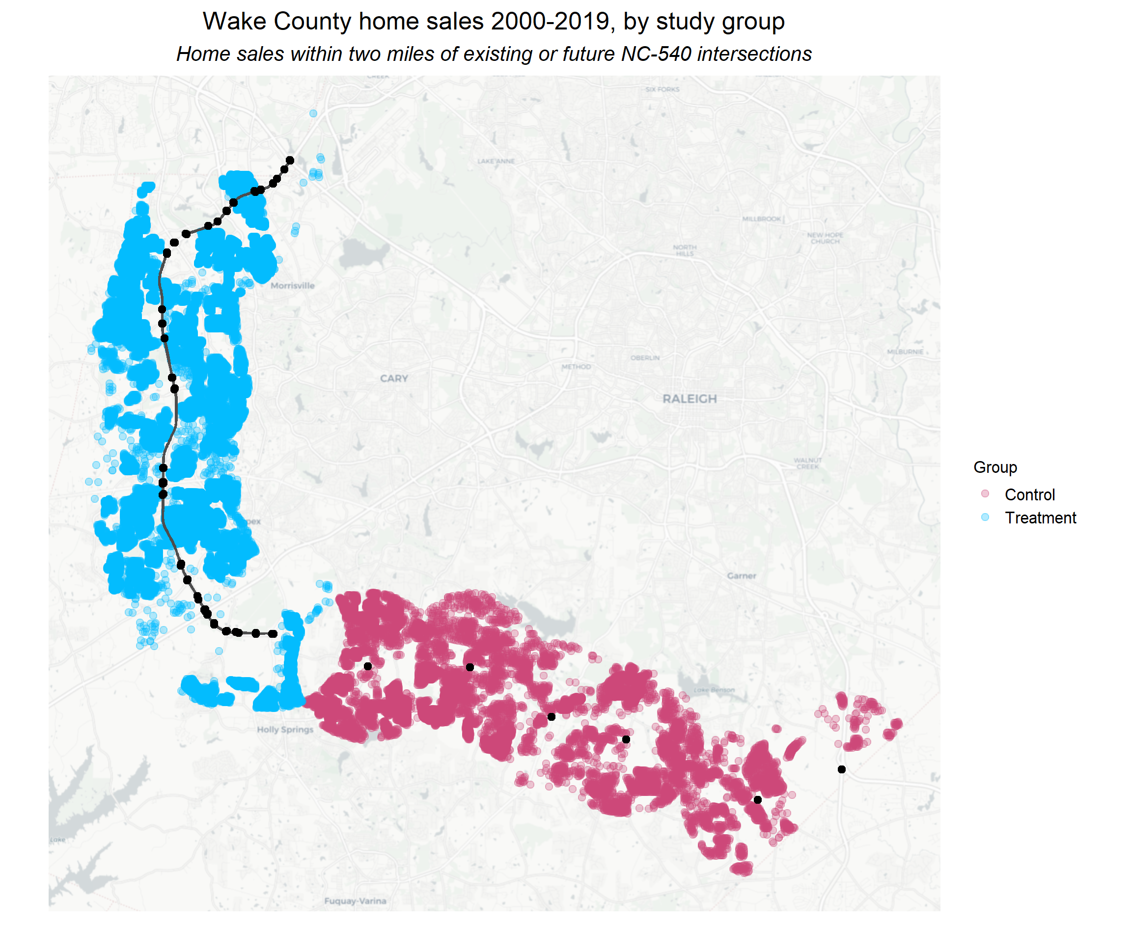
This result is robust to a placebo test, indicating that these results can be attributed to the opening of the highway in 2012. Examining the parallel trends of treatment and control groups, we see that after 2012, homes within the treatment group (i.e. homes with access of NC-540) saw their home values increase at a greater pace than those in the control group. It also appears that home values in the treatment group were more resilient to the 2008 financial crisis despite not yet having access to NC-540. It is possible that anticipation of the future highway helped buoy these homes’ values at that time.
For deeper discussion into my methods, check out my report. This report was prepared for my class on Quasi-Experimental Design Methods. I used R for the analysis.
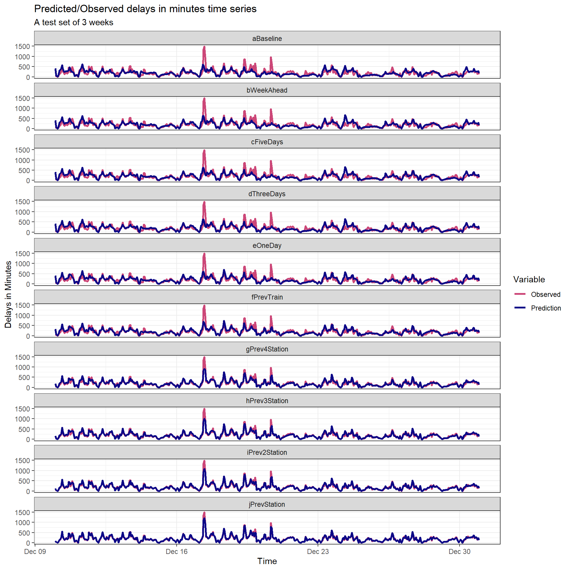
When will the train arrive?: Predicting NJ Transit Delays
Commuters need to get to their destinations on time. To provide commuters with greater insight into their commute, my colleague Jack Rummler and I created a fictional app that predicts NJ Transit train delays in advance. I led our model’s development and built our predictive model in R.
Our app’s predictive models were highly accurate - on average, our predictions were off by just 26 seconds. Our combination of models provided increasingly accurate delay predictions up to a week in advance.
Follow along with our code here, or watch our presentation here.
How much will that home sell for?: Predicting home prices in Mecklenburg County, NC
Mecklenburg County, NC is home to more than a million residents and the city of Charlotte. Using Python, I created a simple machine learning model to predict home prices across the county.
I used a spatial analysis of Local Indicators of Spatial Autocorrelation (LISA) to hone in on statistically significant clusters of high and low home prices.
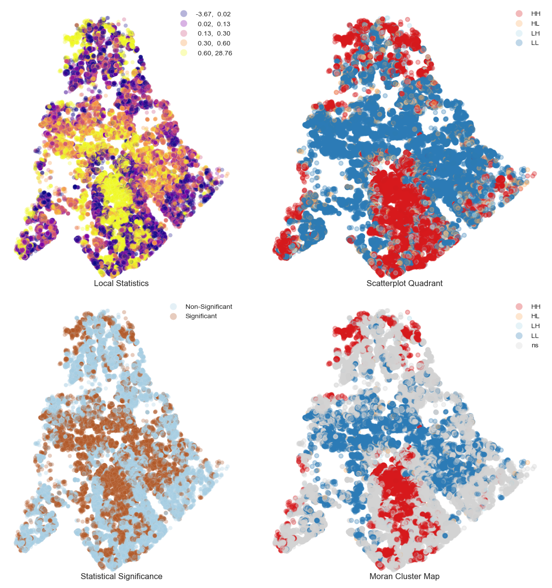
Follow along with my Python code here.
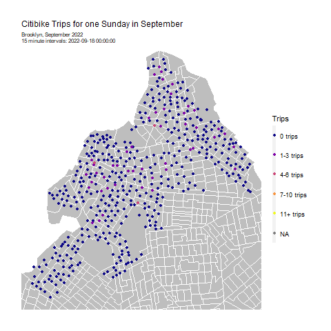
Solving an Operational Puzzle: Forecasting Citibike trips for system rebalancing in Brooklyn, NY
Citibike lets New Yorkers hop on a bike when they want, to go wherever they want. No more worrying about where to lock up a bike - Citibike’s stations have dedicated slots to securely return your bikes. And no more having to schlep your bike home - bike share means that you can take one-way trips and not have to worry about your bike when you’re done. It’s convenient, easy, and affordable.
This convenience of on-demand bikes creates a puzzle for Citibike: how to ensure that bikes are available where and when they’re needed? If bikes aren’t available at the right place and the right time, ridership and revenue will fall. It’s therefore very important to rebalance bikes in the system: i.e. move bikes from areas of low demand to areas of high demand, before the high demand begins.
To help Citibike rebalance bikes, I created a model to forecast bikeshare demand in Brooklyn. Follow along with my R code here. This project was originally an assignment for the University of Pennsylvania’s Public Policy Analytics course.
Are New Yorkers Willing to Pay More for Subway Proximity?: An Exploratory Analysis of Transit Oriented Development (TOD) in New York City
New York is famous for its iconic subway and sky-high rents. But even in the face of such high rents, are New Yorkers still willing to pay more to live close to the subway? If they are, the City could consider zoning changes to allow more development close to transit. Increased density could mean increased tax revenue, potentially allowing the City to reinvest that income into expanding the subway and other city services.
In this policy brief, I investigate whether rents are higher in areas close to the subway, compared to areas without subway access, and how that has changed over time between 2011 and 2020. I include my R code to demonstrate how I performed the analysis.
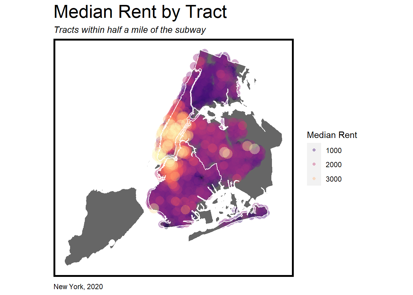
This brief was completed as an assignment in my Public Policy Analytics course at the University of Pennsylvania.
Predicting Churn: Who will enroll in a housing subsidy program?
The fictional Emil City Department of Housing and Community Development wants to figure out how to increase enrollees in a housing subsidy program. I used their campaign data to understand who was more likely to enroll in or drop out (churn) from the program.
I completed this assignment for the University of Pennsylvania’s Public Policy Analyitics course. While the housing subsidy is fictional, the data set used is from a real loan program. This data turned out to be very challenging to build a model to correctly predict for, but I ultimately built a model that correctly predicted enrollment 12.6% of the time – a modest but positive improvement from the program’s previous success rate of 11%. I built this model using R.
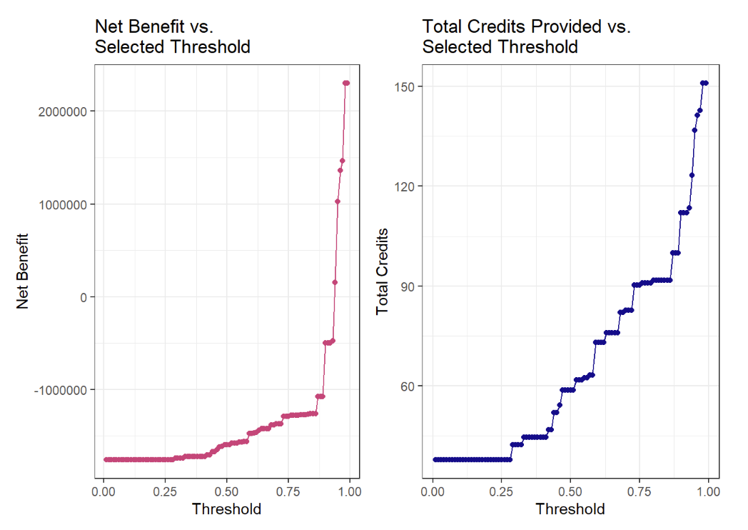
Follow along with my R code here.
Page template forked from evanca